![]() Preparing charts for output - Chart Tools
Preparing charts for output - Chart Tools
|
|
Top Previous Next |
|
As well as editing the standard chart options, there are many tools you can use to improve your charts for printing or publication. These appear in the Chart Tools Gallery of the Edit Chart dialog. We feature a few below; there are many more to explore.
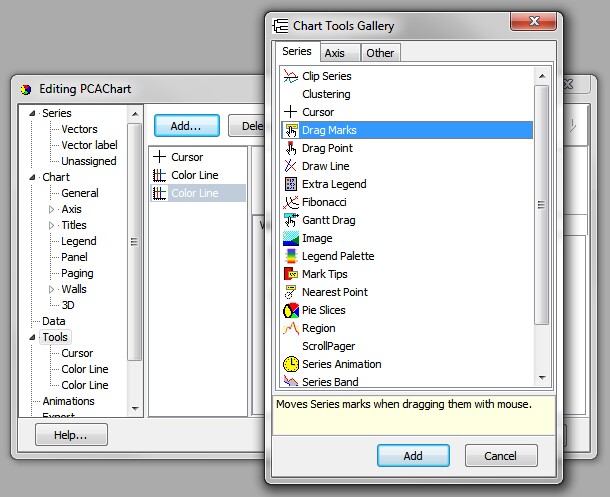
Moving Chart Labels Click the Edit button to change a wide range of aspects of the graph, add titles, and use various tools to customise the chart. One of the most useful tools allows you to drag the chart labels - very useful if you have a cluster of points with overlapping labels. Click the Edit button, then the Tools tab of the Edit dialog, the Add... button, and choose 'Drag Marks'. Click the "Add" button, then on the next dialog box, click "Close". When the chart is displayed, you will find that the cursor displays as a hand symbol on hovering over a data label, allowing you to drag the label to the desired position.
NOTE: any alteration of other aspects of the graph will cause the labels to return to their original position. Therefore, moving the labels should be the last alteration you make before printing or exporting the graph.
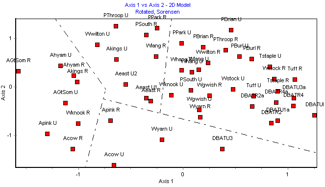
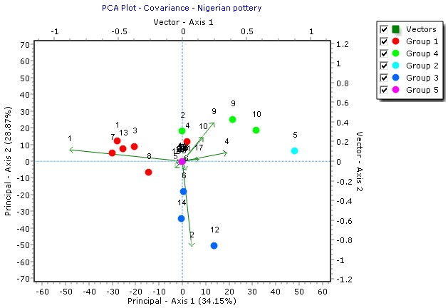
Drawing Lines If the new group perimeter method is not appropriate to your needs, you may find it useful to draw lines on a chart, to separate groups or clusters of points, for instance on an MDS plot (below).
Groups can also be shown as different colours and symbols.
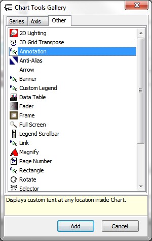
Annotations can be very useful if, for instance, there are a large number of points on your chart and you wish only to label a few of them. To add annotations:
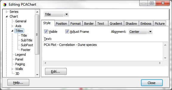
Altering chart titles
Enter the new title text into the box and click 'Close' to save.
Note that there are very many options on the Edit screen and it is worth a few minutes' experimentation to see what sort of effects are available to enhance your charts for publication or display.
Changing the order of items in the chart legend
When you have performed an analysis, if you enable the plot legend, the groups will be displayed on the legend:
If you wish, you can change the order in which the Groups are displayed in the legend; click the Edit Chart button, and on the Series tab, select a Group, and use the Up or Down arrow to move it into the order you want. When an item is shifted up or down the list, its position on the chart legend will change accordingly.
|