![]() Rank Abundance
Rank Abundance
|
|
Top Previous Next |
|
This button shows the graph of log species abundance against log rank order for each sample. It is often the first step in any analysis. Each sample is displayed separately and distinguished by line colour.
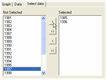
If the data set includes a large number of samples then only the first 16 can be unambiguously displayed at one time because of screen/printer colour and resolution limitations. It is therefore possible to choose which samples to include in the plot from the Select data tab.
Select using the selection buttons between the two boxes which hold the unselected and selected samples.
See Rank abundance plot tutorial
|